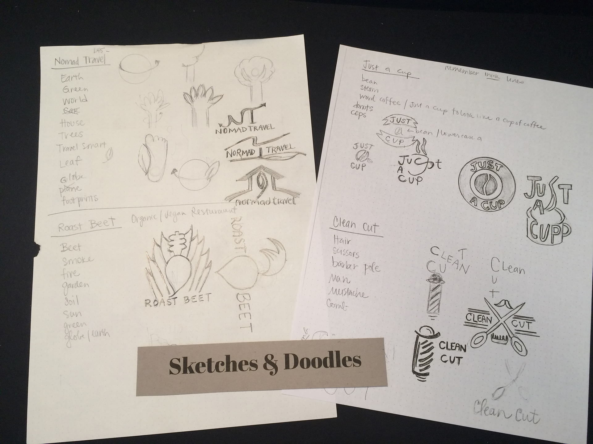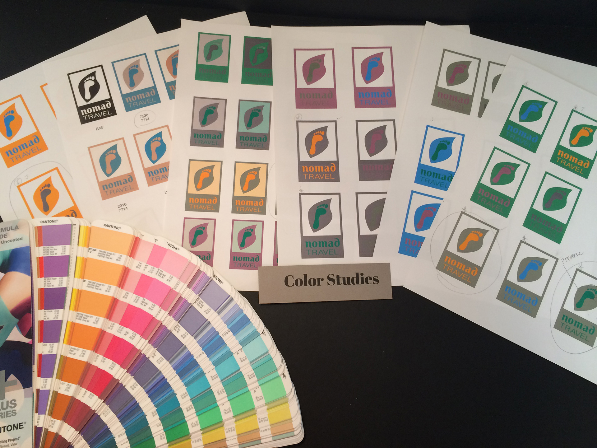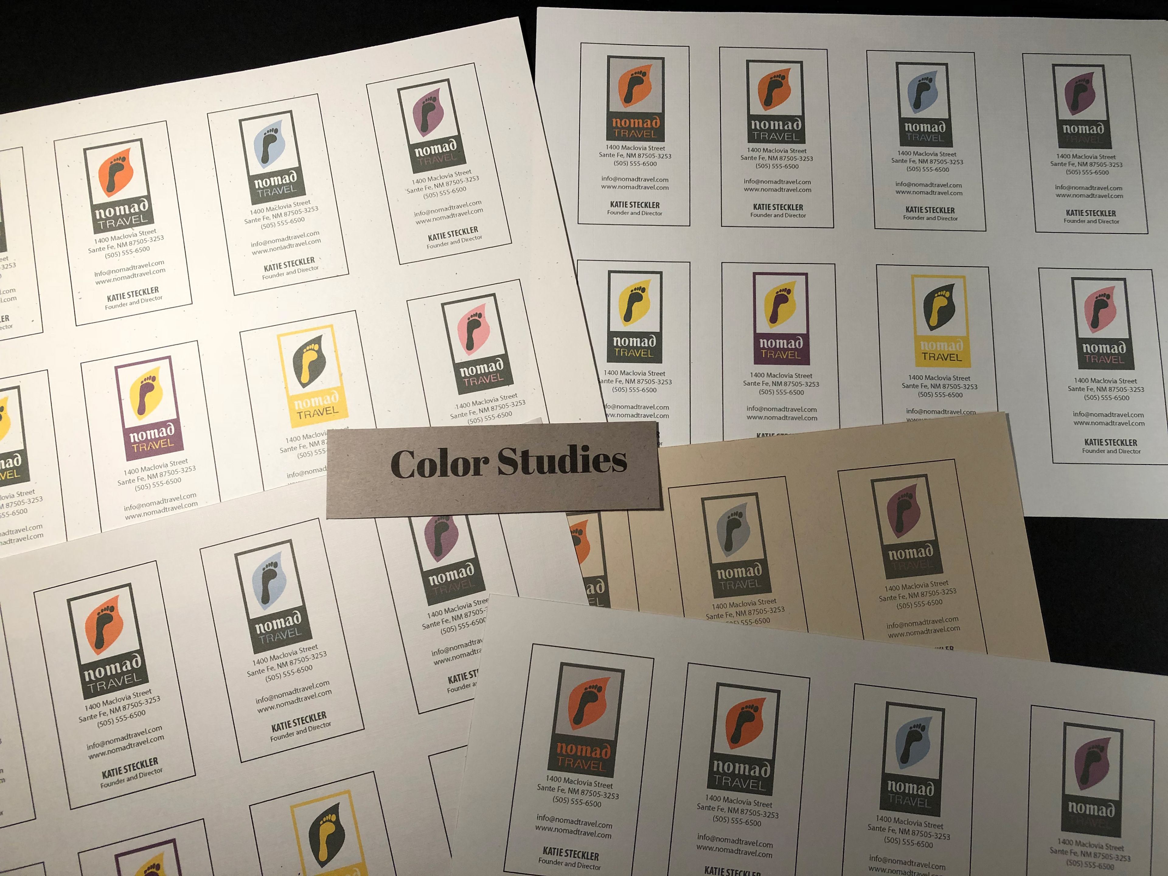


I chose Nomad Travel because it is a "green" travel agency that helps save our planet. I also love to travel. With the combination, I saw this as a bit of a challenge. I did not know much about what green travel meant but wanted to learn about it. Green travel respects ecotourism in a way that it respects our Earth by not damaging it with fuel debris, minimize environmental impact and damage, it could even cost less and still be just as much fun. I designed the logo based after this theory. I used a foot as a way to show that we leave our footprints behind and not our car tracks. I added a leaf to represent it being a green travel agency. For the typeface, I added a simplicity of it to represent that "going green" is a simple way of life. I did alter the typeface to tie in the leaf by making the ends curl just like a leaf does. As for the color of the logo, I wanted to bring in the colors of beaches, sand and the majestic ocean.
