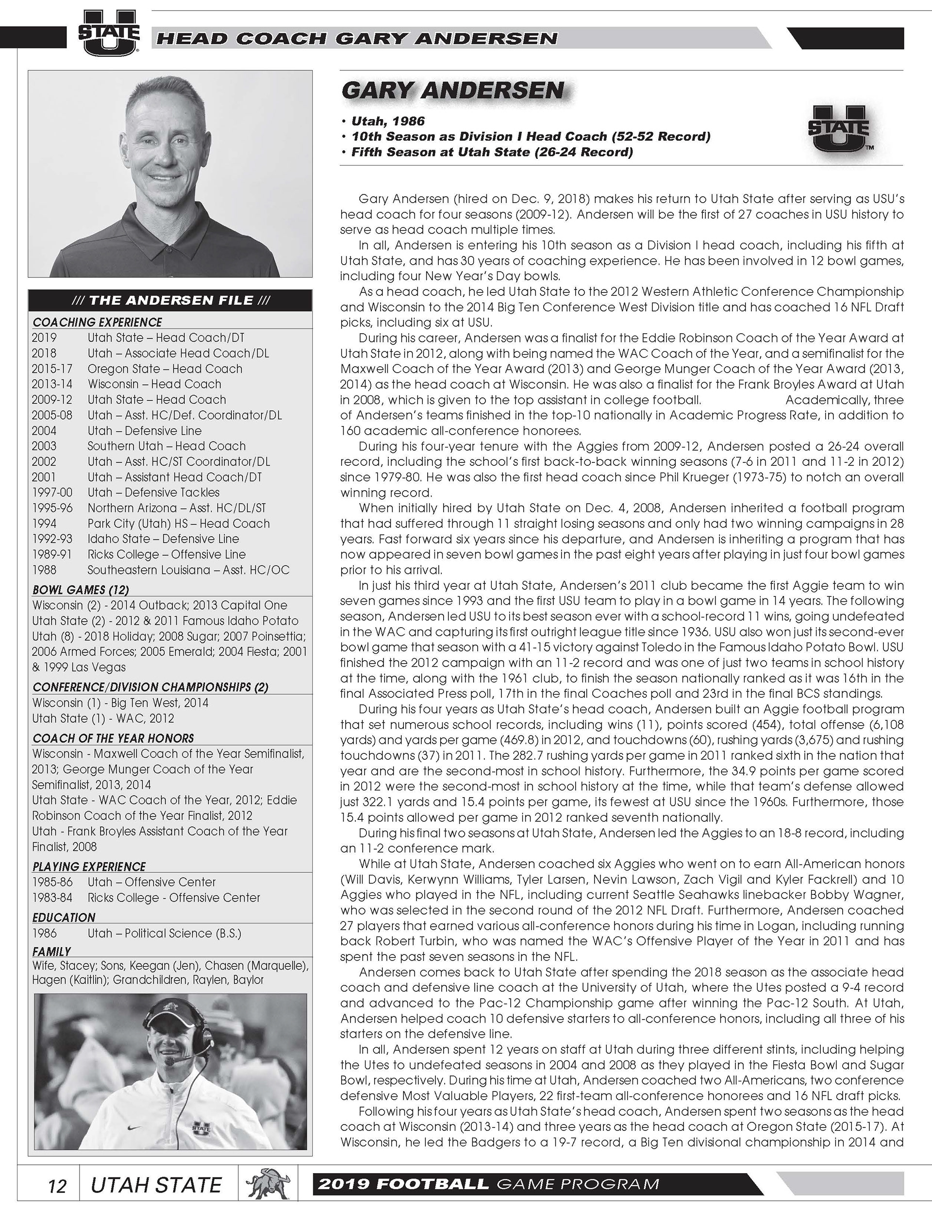
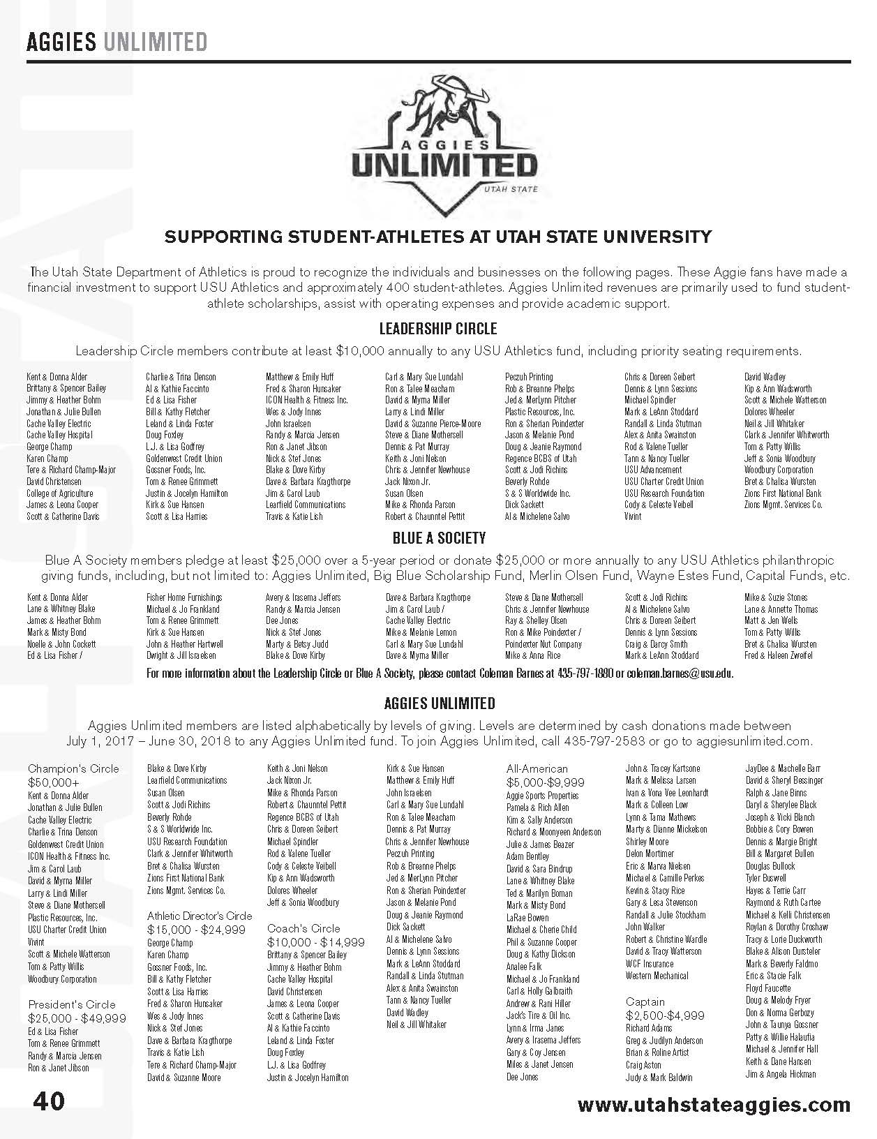
Working with Utah State University to get their game books ready for their home games brought a lot of insight to how the publication and design side puts these together for the big game.
I first had to design the front cover for the whole season by only knowing what the first player looked like. The photo came to me as a photograph. With my talents with photoshop, I was able to cut out the background and perfect the photo to work well on a magazine cover.
I wanted to incorporate a design throughout the letters of GAMEDAY and the cover background to work together. I found a marble/stone background and lightened it in photoshop to give it a crisp white color and I placed it inside the letters.
I also needed to add more photos on the side to highlight the other players in the magazine. I wanted to incorporate an arrow as to point and designed what you see below.
The first picture was a bit tricky in a way that I didn't want to cut off his left arm. I zoomed it in so close that the main focus was on the football and it gave a space for the highlighted players under his arm.
As for the typeface, I chose something that wasn't fancy or with any flare. The focus needed to be on the player, not the type.
I also needed to design the headers and footers inside the magazine to incorporate the front with the inside, bringing together simplicity and precise.
