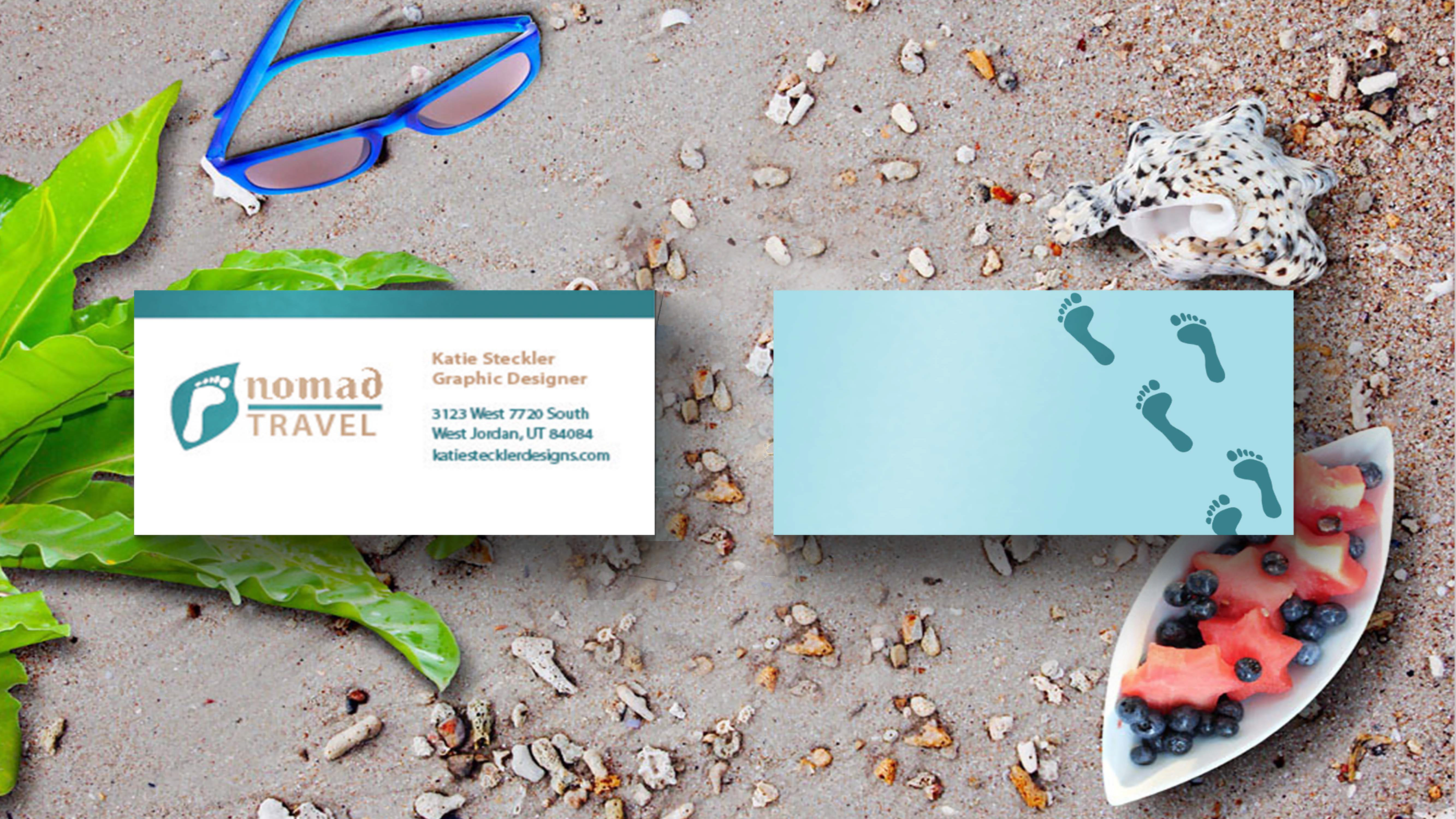
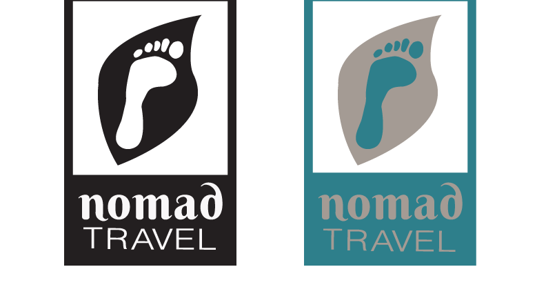
My branding project from Advanced Design is called, “Nomad Travel”. This is a “green” travel agency that finds islands that have been not taken care of and are in need of some civilization to help nurture the lands, animals and give some sort of serenity and peace. I designed the logo based on the “green” and combined the leaf and a footprint to be apart of the design. I also designed the text. I used the effect of the tip of the leaf into the aspect of the letters. The problem that I had was to balance the thicks and thins to make sure it gave it balance. I went for simplicity and elegance to bring in the elements of a “green company”. I chose the green banner on the bottom to also give it balance.
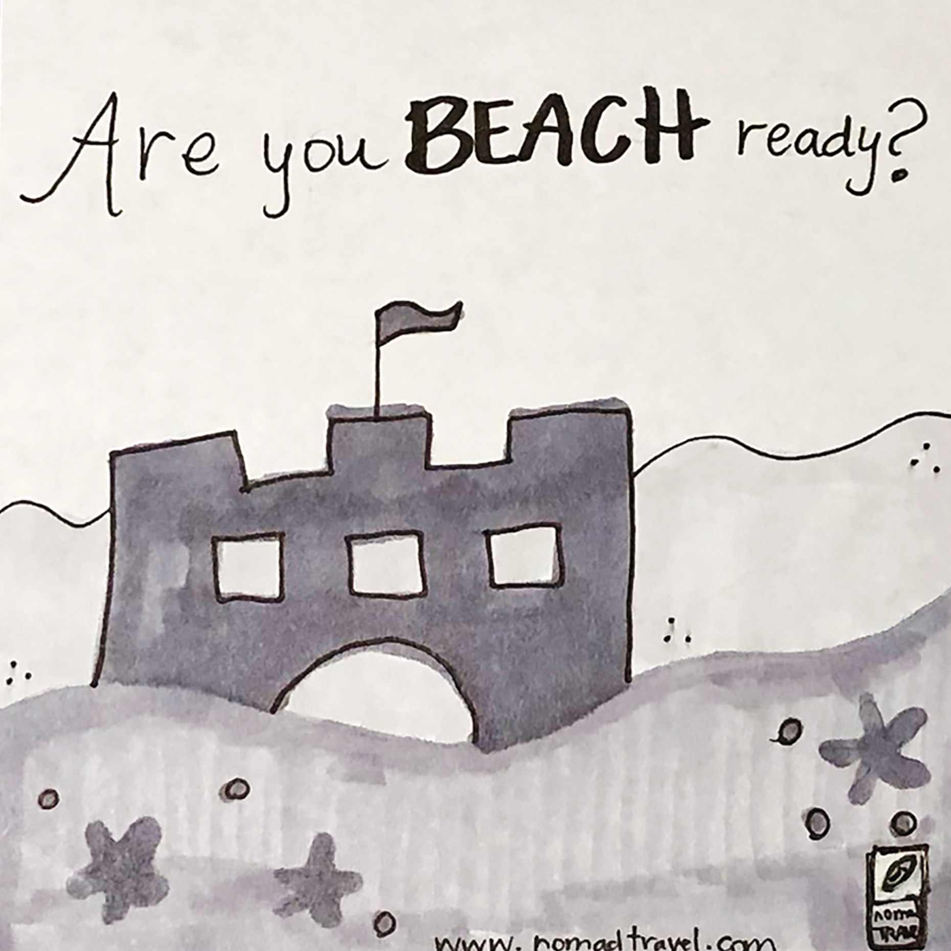
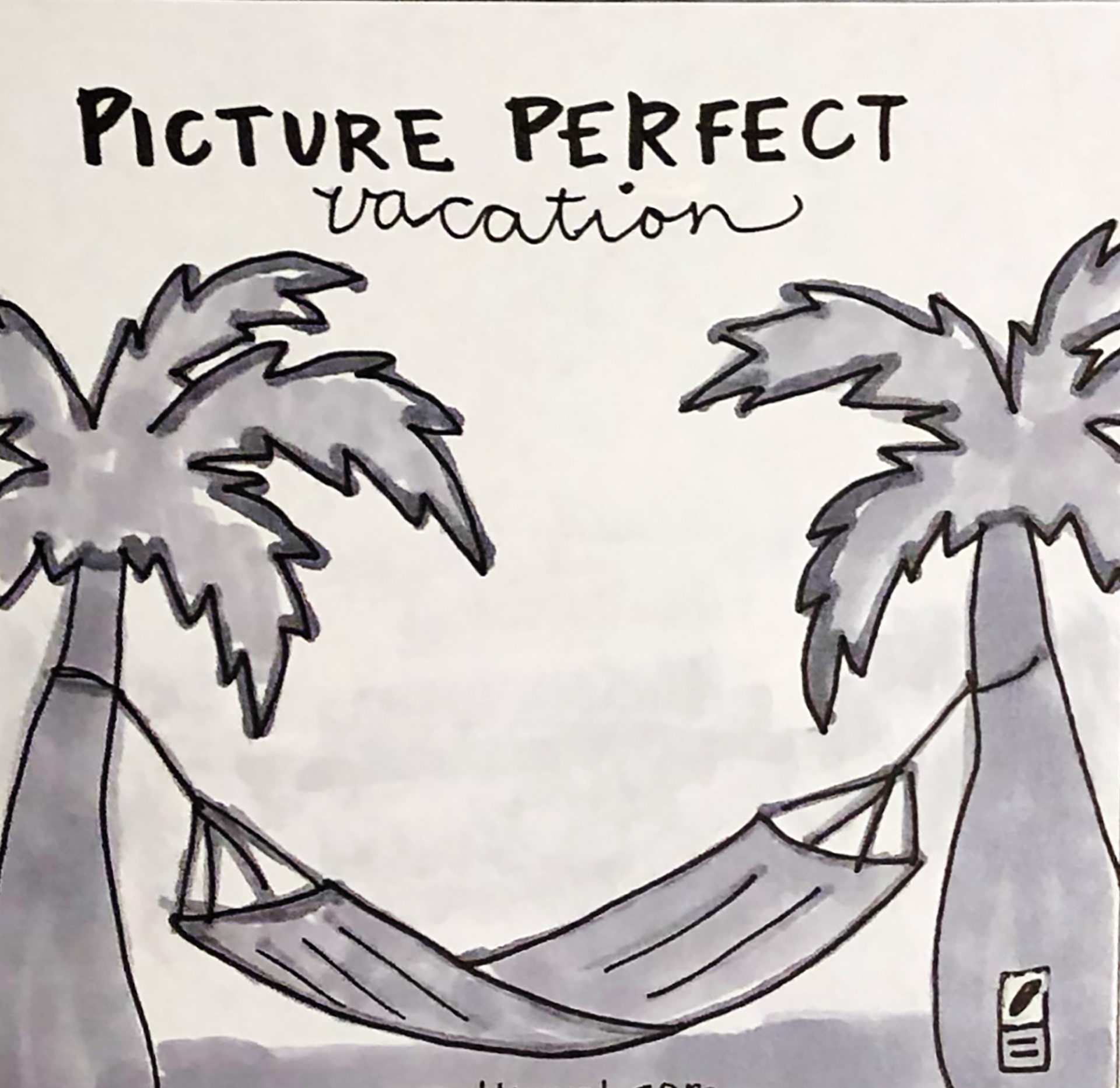
When I designed the newspaper ad, I imagined what it would look like in the newspaper. I wanted the ad to be simple and clean and right to the point. I wanted to show that if they book with Nomad Travel, then they will be relaxed on their vacation. To me that what a vacation is all about, that is the real reason to even take a vacation. It is to get away and forget all of your sorrows and stresses at home. In order to do that I wanted a picture of the beach. The beach alone says a lot all by itself. I also wanted to design a quote that would help associate all of the elements to tie in together. I emphasized the word perfect to help sell the company and to entice them to book with Nomad Travel.

After I studied how to do an annual report and did some research with what other companies did for their businesses in their report, it showed me how to do make one that was effective. I started the annual report by displaying some pictures that we would have at our resort. On the inside I wanted to show that one of our main focuses was to show friendliness from our president and that we try everything that we can to protect and save sea turtles that live on our beaches. I also wanted to pull some elements of the beach and things found at the beach. I wanted to implement that we are saving our world one step at a time. The colors that I chose were from the sunrise and sunset, clear waters and bright colors to show fun.
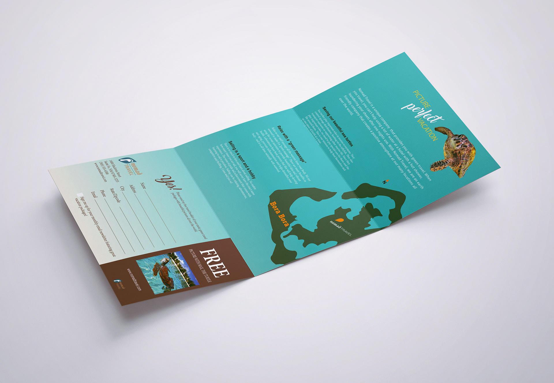
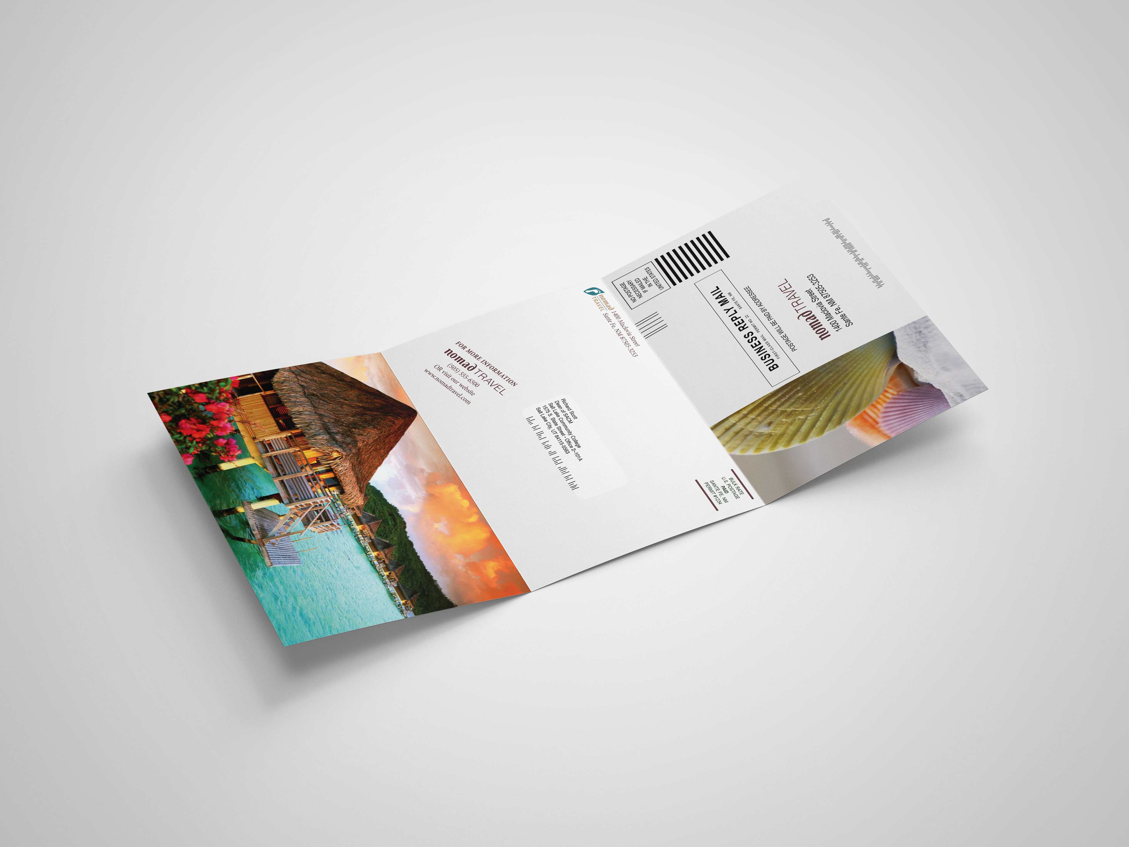
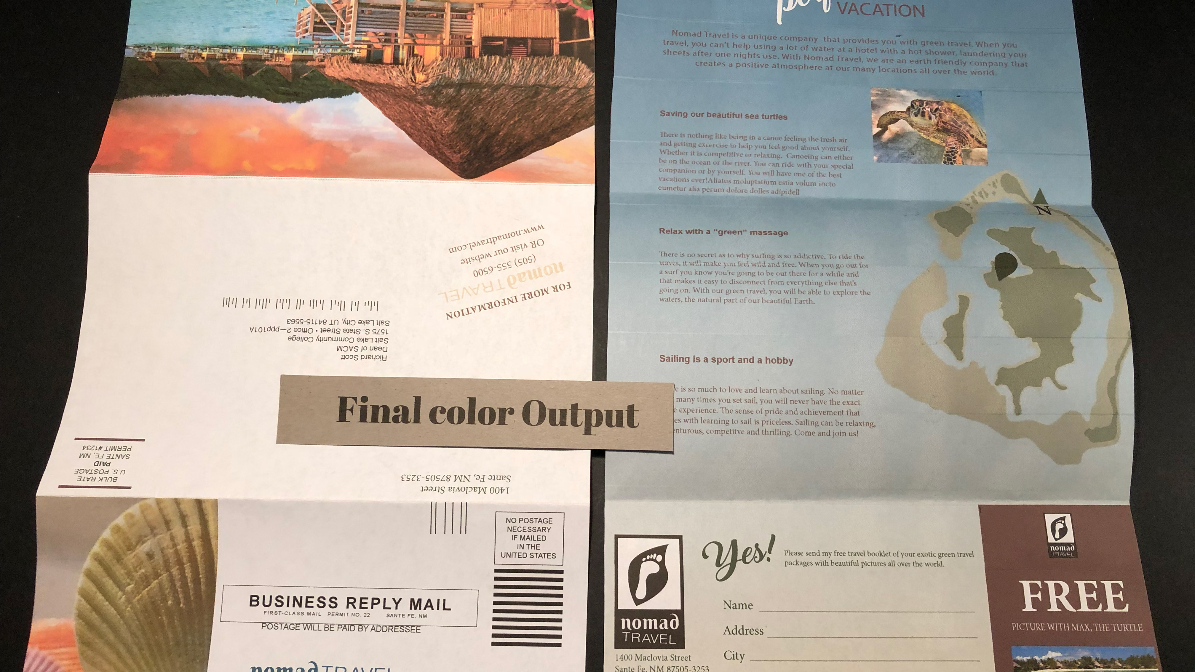
My goal to design this brochure was to make a good impression to the future customers that may be interested in booking a vacation with Nomad Travel. Bringing in the bright colors from the beaches with the bright blue of the water, the colorful seashells and the white sand that they can imagine their feet walking through. I also wanted to show a map of one of our top sites in Bora Bora. I kept my design simple and yet effective to help the customer to want to book their vacation with us. I also wanted to implement that we are a green travel company. I am also very fond of sea turtles and with my research, I was sad to find out that they are endangered. I brought in sea turtles to show that we can protect them and still have green travel.
